 ) the document to see what the dashboard looks like. You may need to hit “Try Again” to get the pop up window to work.
05:00
The Data Analysis Pipeline
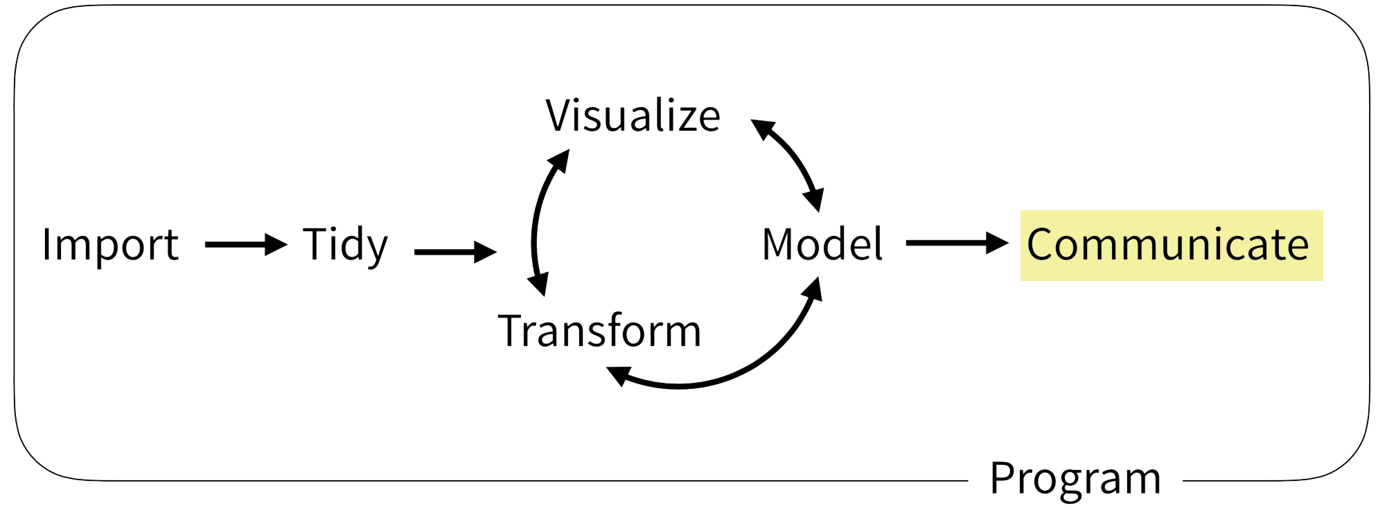
Dashboards visualize key data on demand 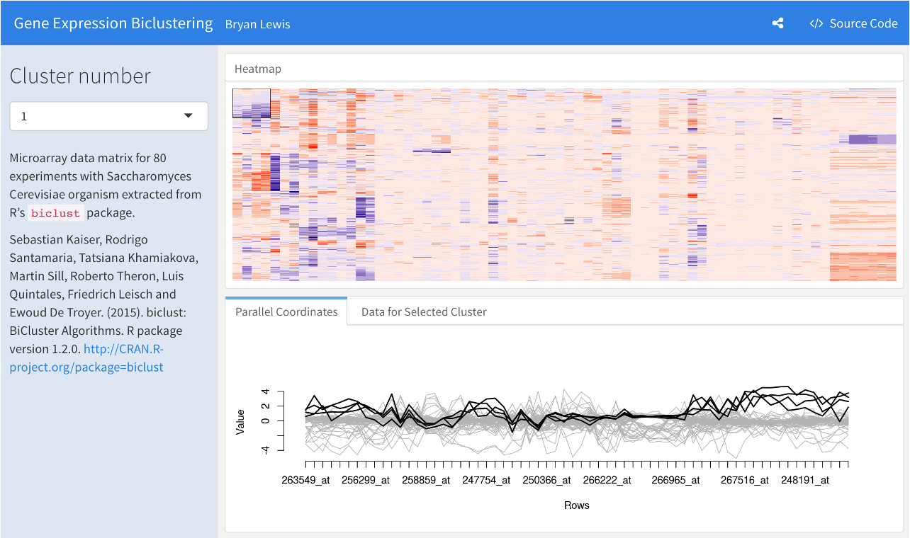
![]()
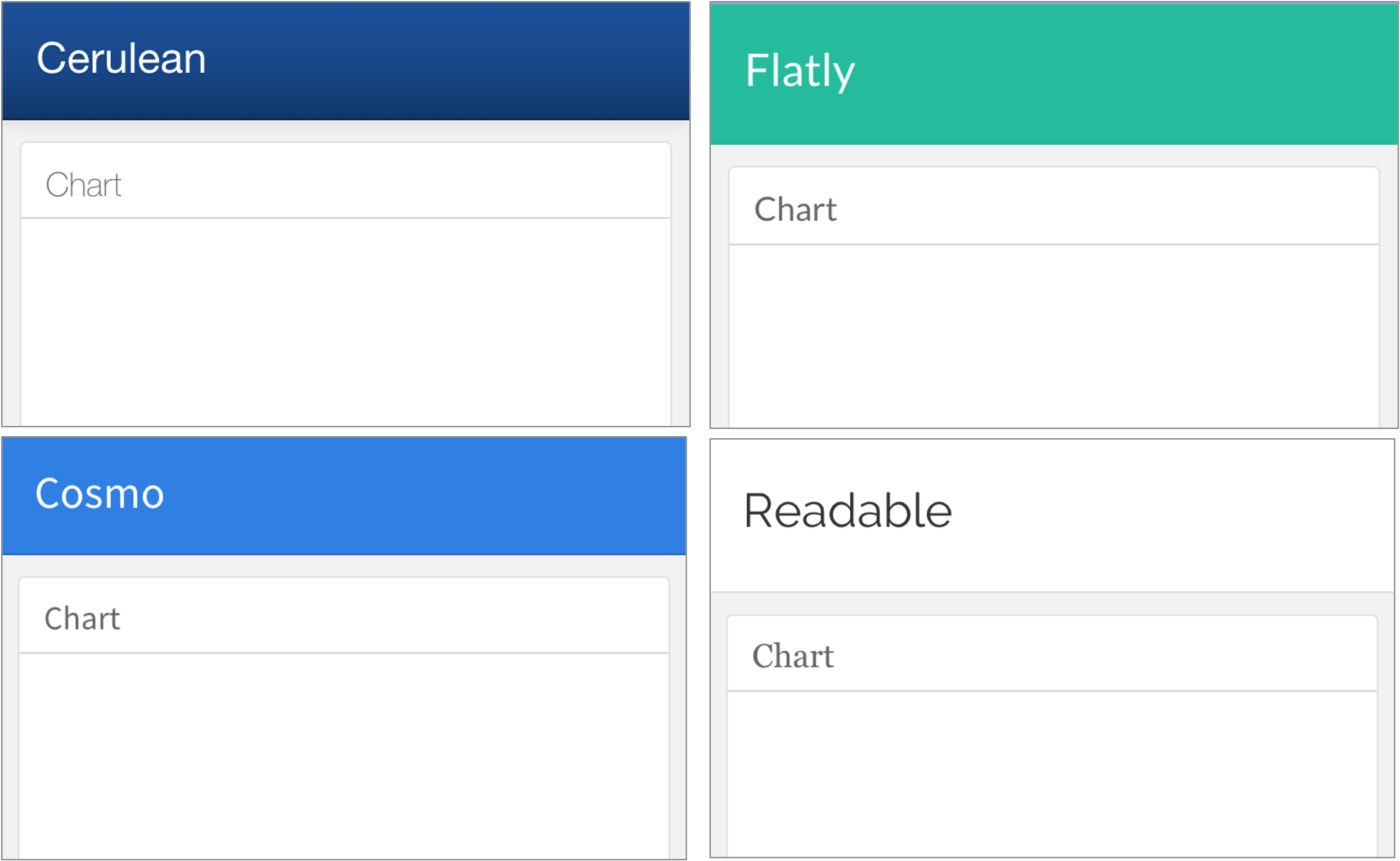
Turn an R Markdown document into an interactive dashboard

Your Turn #1
Open 04 – Dashboards.Rmd to work with a draft COVID19 flexdashboard. This file will look a little different than your previous Quarto files. Don’t fret – this R Markdown file works the same as Quarto! Do the following:
- “Knit” (
![]() ) the document to see what the dashboard looks like. You may need to hit “Try Again” to get the pop up window to work.
) the document to see what the dashboard looks like. You may need to hit “Try Again” to get the pop up window to work. - Change the Test Volumes Over Time plot so that it visualizes the fraction of positive tests on a given day. (Hint: map the fill aesthetic to result). Knit the document again and note the change.
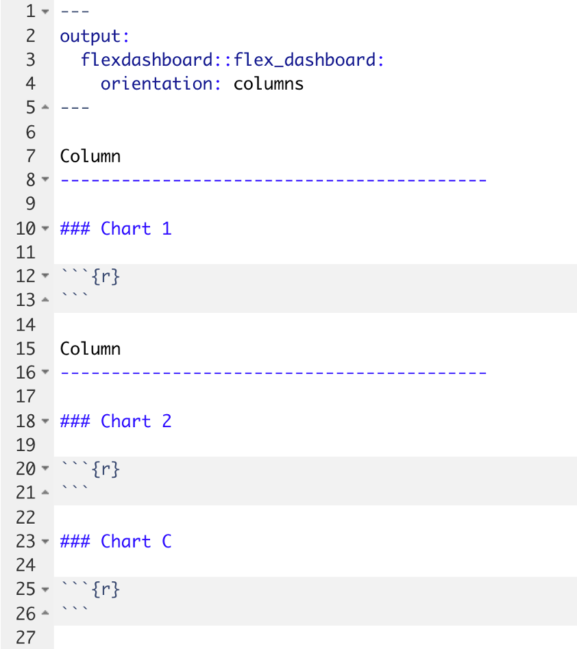
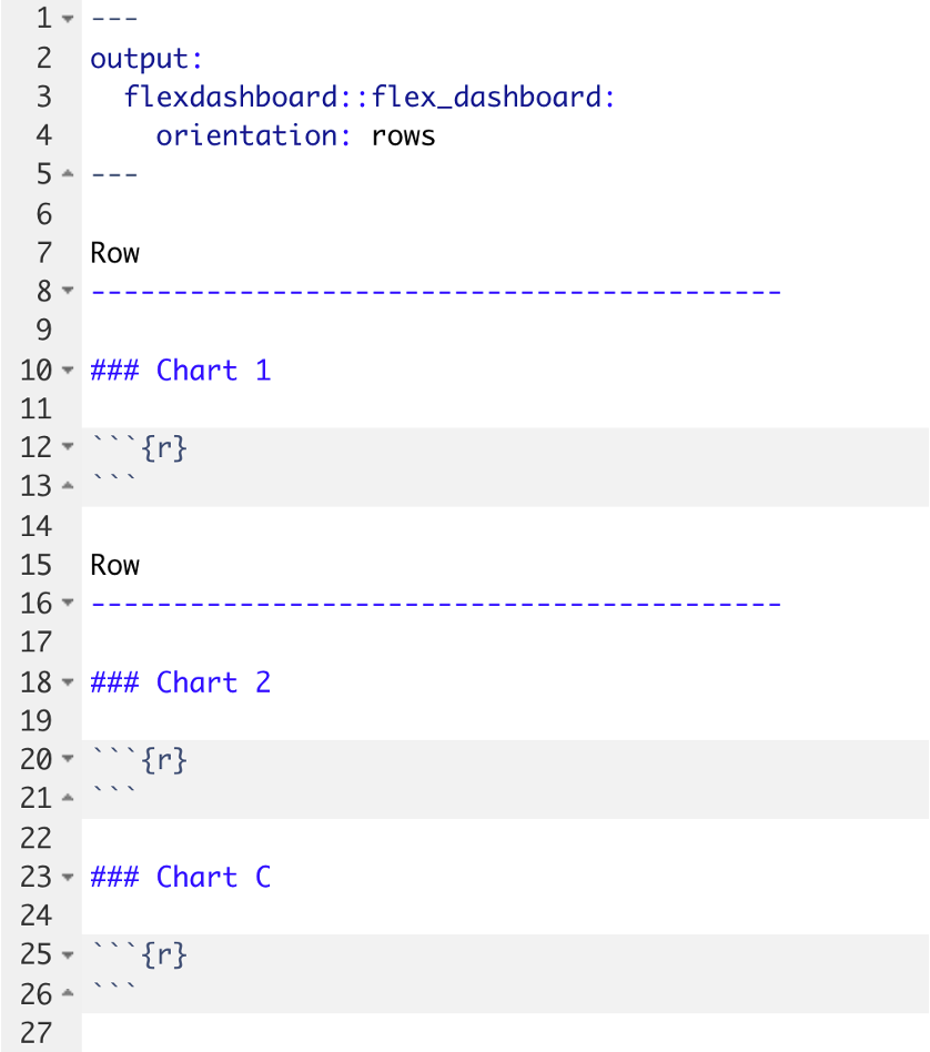
- Change the layout from columns to a row orientation. Knit the document again and note the change.
Click “yes”  when you are finished!
Plotly Makes ggplot Interactive!
Start with some ordinary ggplot code:
ggplot(data = data_frame) +
  geom_function(mapping = aes(mappings))
Save that as my_plot, then add some plotly magic …
my_plot <- ggplot(data = data_frame) +
    geom_function(mapping = aes(mappings))
ggplotly(my_plot)Your Turn #2
Return to 04 – Dashboard.Rmd.
Make the Test Volumes Over Time plot interactive.
Knit the document again to note the change. Hover over the interactive plots. Note what happens when you click on the various buttons that appear above the plot.
Click “yes” when you are finished.
03:00
DT Makes data frames Interactive!
Start with a regular data frame:
covid_testing
And pipe that to datatable() from the DT package:
![]()
covid_testing %>% datatable()
Your Turn #3
Return to 04 – Dashboards.Rmd. Let’s try to display a list of positive results in the Details of Positive Test Results area of the plot.
- Note that this area currently shows the contents of the
covid_testingdata frame but doesn’t actually filter for positive results. Add to the pipeline afilter()statement that selects only those rows where the result value is “positive” (Hint: “positive” must be in quotes). Knit (![]() ) the dashboard and note the change.
) the dashboard and note the change. - In order to use the
datatable()function, we first need to load the DT package. Add a line to the setup chunk (all the way on top!) to load the DT package. - Now make the table interactive! Knit (
![]() ) the dashboard and note the change. Click “yes”
) the dashboard and note the change. Click “yes” ![]() when you are finished!
when you are finished!
03:00
Recap
![]()
Turn R Markdown documents into interactive dashboards with flexdashboard
![]()
Turn ggplot objects into interactive plots with plotly
![]()
Turn data frames into interactive tables with DT
What Else?
![]()
A framework for developing interactive web applications in R: deploy in shinyapps.io, Shiny Server, or RStudio Connect.
Next Up: Final Notes
Our next topic is: